
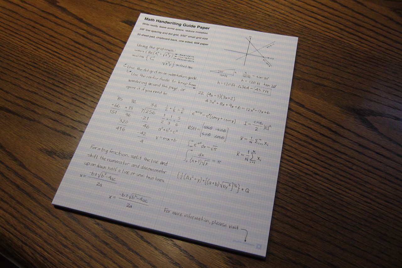
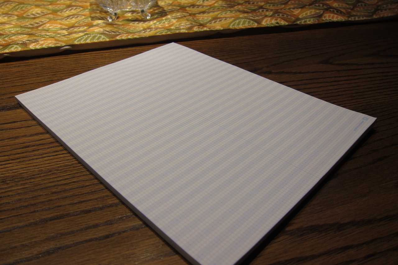
My first paper product, a math handwriting guide paper, is here and available for sale (sales are paused at this time). It is initially available in a 50 sheet glue bound pad of single-sided, 60# text uncoated paper in 8.5" x 11" letter size. It has a cover sheet with examples of using the paper which is covered in more detail on the Using Math Paper page. For any questions not answered here, please contact me at ryan@graytrek.com.
What is it?
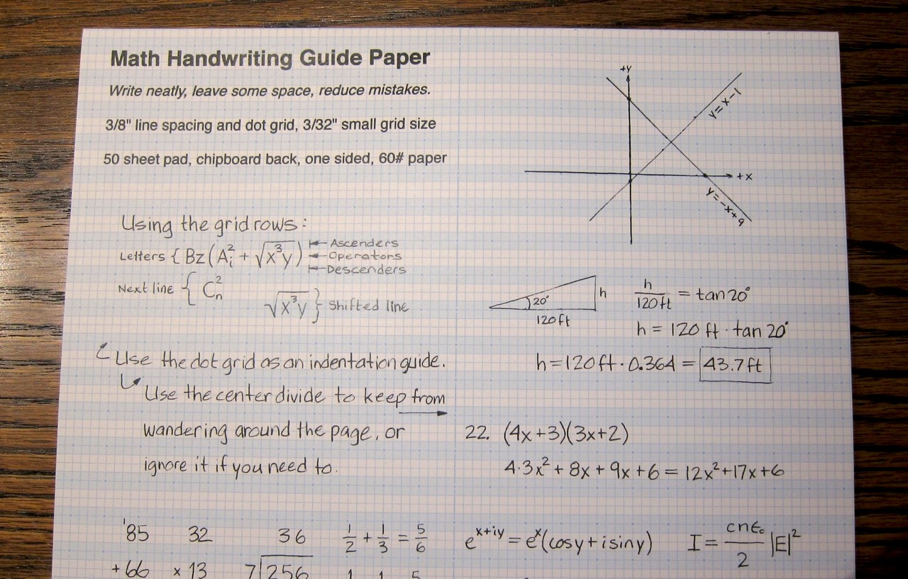
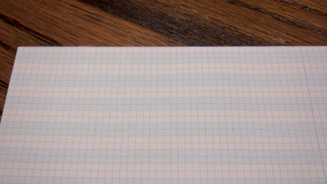
A combination graph and bar-rule paper designed to help guide the handwriting of math to practice writing math more neatly.
This is intended for young math students to help guide their handwriting of mathematics to help it be neater and more readable, which can also reduce mistakes. It is also useful for science and engineering work that is equation-heavy writing where you might use ruled paper instead of graph or engineering paper.
School doesn't really take the time to have you practice writing math like you do when learning to write. It seems assumed that if you know how to write prose, that you'll be able to write math. Fortunately, many math texts have good math typography that you can look at for examples of how to write math.
This paper can help by giving you some guides to follow such examples. Later on, when your math handwriting matures, you may only need regular paper.
I made this initially for my daughter to help improve her math handwriting. As I refined it, I found it useful too for writing equations and practicing my math handwriting.
The Paper
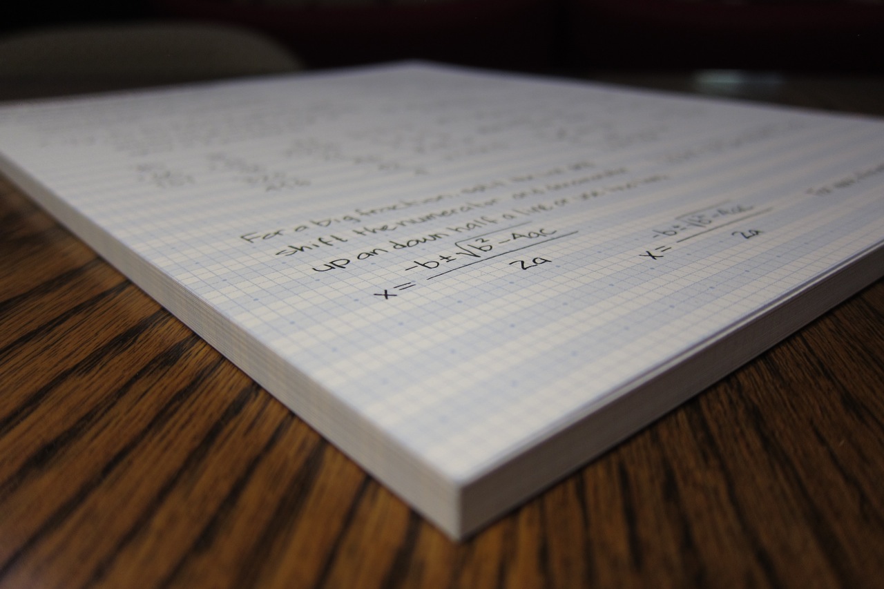
I chose to go with a thicker 60# text (90 g/m^2) white paper versus a copy paper (50# text or 20# bond, 75 g/m^2) or something thinner.
Contrast
A colored paper might be generally easier on the eyes for long periods since it reflects less light, but the goal here is to provide a good contrast with pencil graphite for readability. White paper and light cyan bars make the writing stand out well rather than the lines. On some paper, the lines are often thick, dark or both, making it hard to read your writing or have to use thick, dark writing to overpower them. The alternating cyan bars cover 50% of the paper, which does reduce the brightness in between the lines of text.
Reduced show-through
The heavier stock prevents most things showing through from the page behind it that might distract. Generally, that will be a blank sheet of math paper, but if the paper were too thin, that page's grid would show through and likely not be perfectly aligned, creating visual noise.
Single sheet writes smoothly
It is thick enough to use without a backing sheet on a hard surface with a pen and still write well.
Reduced pad heaving
The thicker paper reduces the amount of "heaving" up and down that the paper in a pad does as you press and remove your pencil from the page that can make it more difficult to write neatly.
Single-sided
For now, it's single-sided for several small reasons that I might reconsider at some point. It kept the cost of my initial small run down, I don't use the backs much, you can get some show through, and it's more of a bother to use the back in pad form. If I do other forms in the future, it may likely be double-sided.